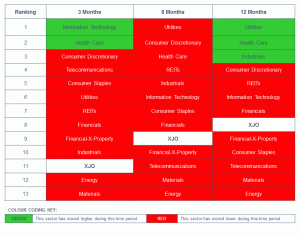
There isn’t too much green remaining as red starts to consume the market in the latest ASX Sector Analysis for the week beginning 18 January 2016.
The ASX Sector Analysis is conducted over three time frames – the last 3 months, 6 months and 12 months. If a sector appears above the S&P/ASX 200 index (XJO), then it has outperformed the XJO during that period. If it appears below, then it has underperformed. The colour depicts whether the index has risen or fallen during that time period.
Click on the image below for a larger, clearer image.


